
Colour to Life
Client: Pakkasmarja
Sector: Frozen Foods / Berries
Market: Finland, Scandinavia, Baltics
Scope: Repositioning and Packaging Redesign
Pakkasmarja’s frozen berries had long stood out in the frozen food aisles. Over time, however, competitors and private labels adopted similar designs, and the brand’s visibility began to fade. Our task was to refresh the visual identity, strengthen recognition, and communicate Finnish origin and quality more clearly.
Cultural Context
In Finland, berries are more than food. They are part of the culture. With 86% of the country covered in forests, berry picking and preserving have been traditions for generations. While urban consumers now buy frozen berries, they still seek authenticity and domestic products they can trust. Finnish origin remains a decisive factor in purchase decisions.
Solution
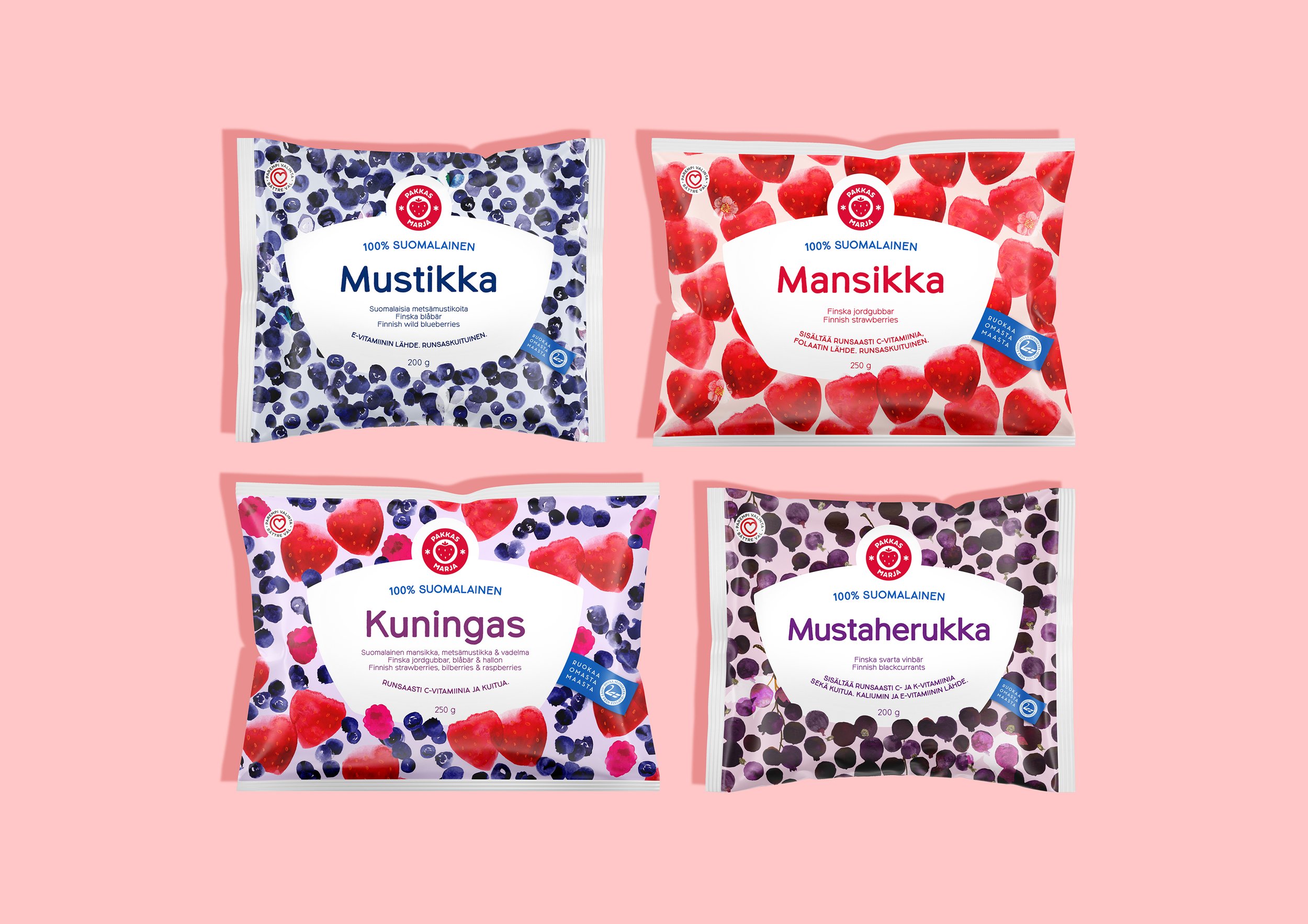
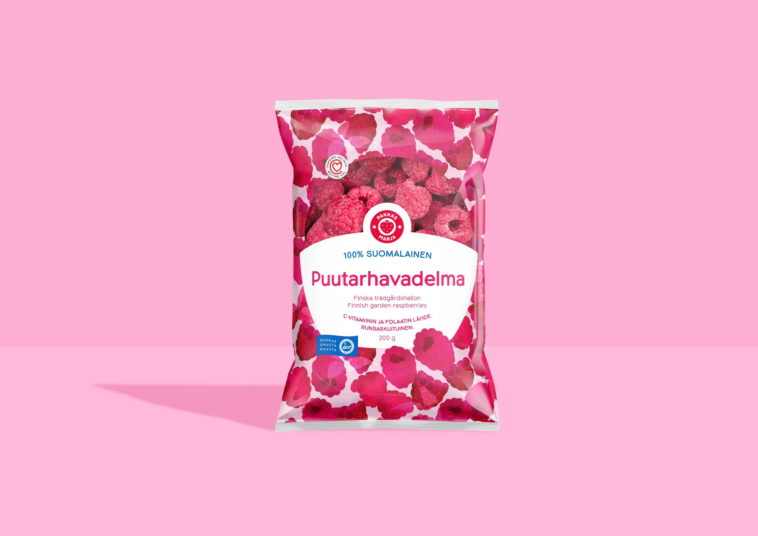
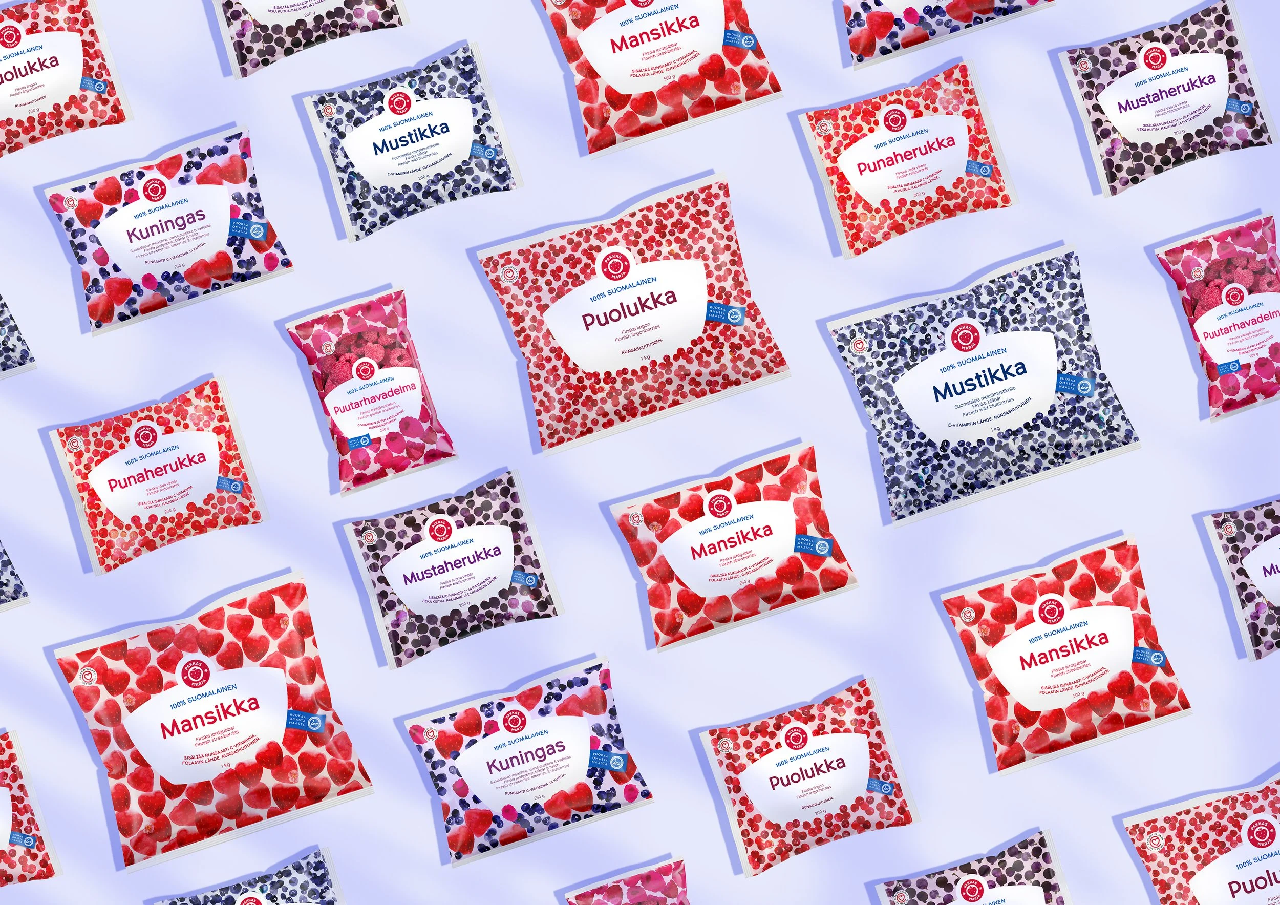
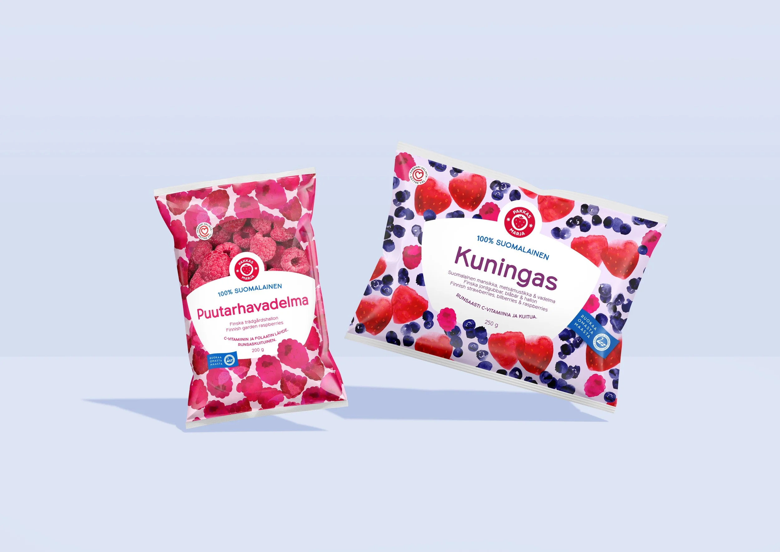
The new concept celebrates colour, nature, and domestic craftsmanship. Each berry variety inspired a unique hand-painted pattern that captures its natural tones and character. Together, the designs create a lively, recognisable brand block on freezer shelves, eliminating the need of POS materials.
The message 100% Finnish highlights the origin and pride behind the products. Every pack features the pattern designer on the back, honouring local creative work and transparency. Future editions will introduce berry farmers and other contributors in the value chain, making the story even more personal.
Beyond the Freezer
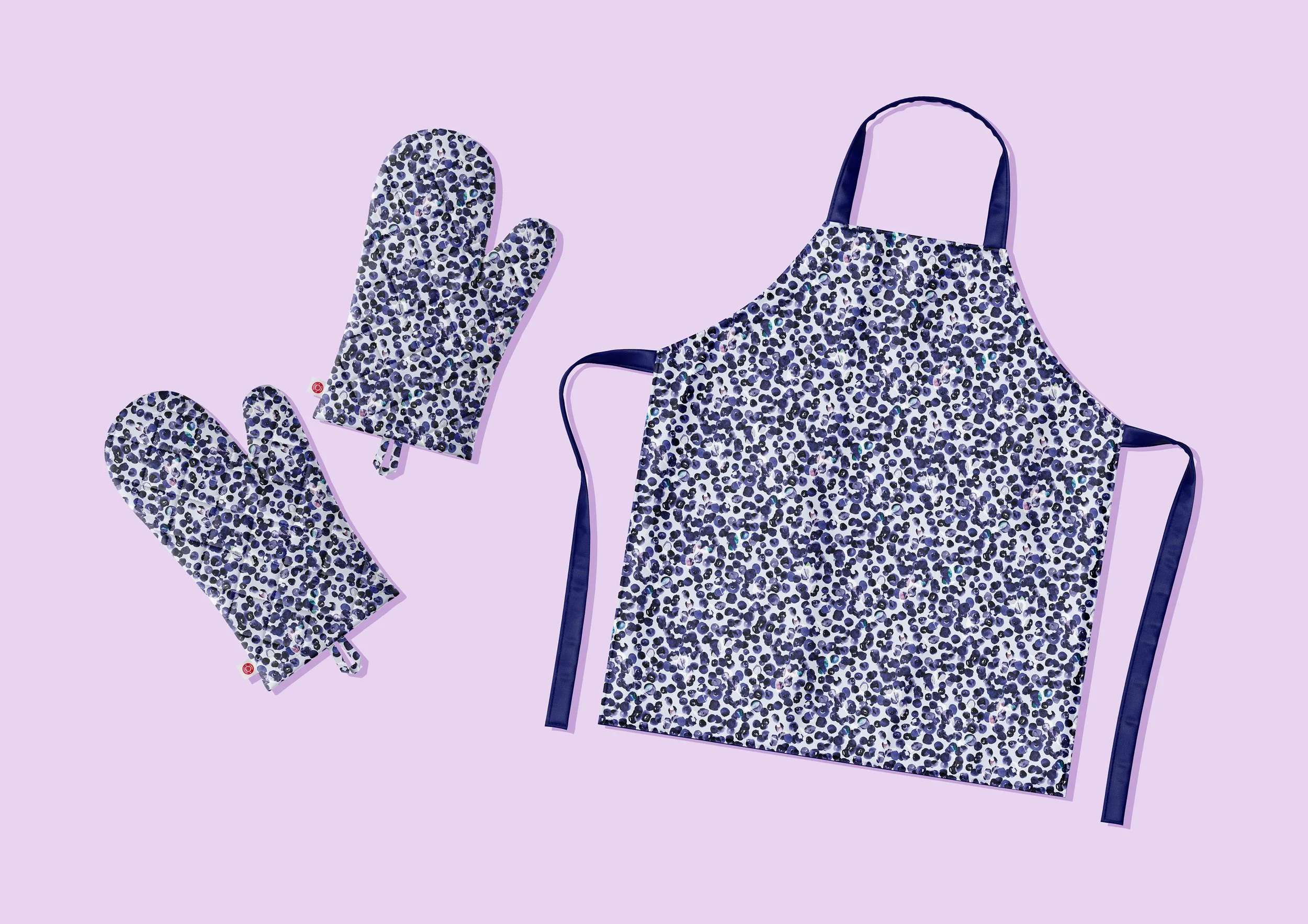
To extend the new identity beyond packaging, Pakkasmarja launched an online store featuring patterned lifestyle products. Made from 100% natural cotton and linen, all items are designed and sewn in Suonenjoki, the company’s hometown. Production takes place entirely in Finland, reinforcing the brand’s commitment to domestic craftsmanship and sustainability.
Cultural Context: Nordic Pattern Design
Bold graphic patterns have a strong place in Finnish design culture. Marimekko, the iconic Finnish fashion brand that rose to fame in the 1960s, continues to shape Nordic visual identity. Pakkasmarja’s packaging draws from this tradition, connecting the brand to a broader cultural story rooted in creativity, authenticity, and the everyday beauty of Finnish nature.
Results
The redesign revitalised the brand both visually and commercially: Raspberry sales rose by 21% and Kuningas berry mix +16%. Increased retailer interest lead to new exclusive branded listings instead of private label products. The strong visual identity removed the need for separate point-of-sale materials.
Services:
Portfolio Architecture
Packaging Design
Visual Identity Systems
Typography
Tone of Voice
Graphic Design
Icons Design
Shelf-ready & Transport Packaging
Point-of-Sale Design
Corporate Communications
Print-Ready Packaging Artwork Production
Localisations